
Autumn in the Lake District is all about colour, and this photo, taken at Derwent Water, just speaks of the season of mists and mellow fruitfulness due to the beautiful warm gold, orange and brown tones in the foliage.
But how to make sure that the colour in the image really grabs the attention. Well there are a number of techniques you can use to make sure that all the viewers' attention is focused on colour. Some of these techniques are in-camera and some are post processing. Let's go through step by step what I did to make this final image.
The first and most important thing to consider is the light. Bright sun is great for walking in, but not much good for emphasisng colour. Instead, choose an overcast day with gentle diffused light, or wait until the 'golden hour' just before sunset to really make the colour in the image stand out. This particular photo was taken in overcast, drizzly conditions.
Next consider the composition. Any overly bright areas in the frame, such as the sky, will draw the viewers attention away from the colour, so try and arrange the scene in the viewfinder so that there are no bright spots anywhere. A crop later on in the digital darkroom can help here as well.
Next comes exposure. When shooting scene that is predominantly one colour it's easy to over expose one colour channel (red in this case), even though the average luminosity is OK. This is where the three colour histogram comes into play. Make sure that there's no clipping in any of the colour channels, even if this means under exposing the image according to the average weighted luminosity histogram.
The next thing to do when photographing colour under natural light is to use a polarising filter. This will cut out reflections from leaves and so on, leaving the pure base colour to shine through. Just hold the filter to your eye and rotate it to see what I mean. The polariser really is a wonderful accessory when colour is paramount.
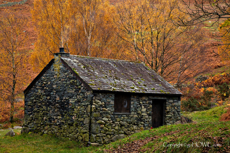
Another thing to watch for is contrast. In order for colour to really stand out in a composition, you need something neutral in the frame for the colour to contrast with. In this photo the neutral tones are provided by the grey stone cottage.
One last thing to watch for before actually taking the photo (we'll get there eventually!) is the white balance. I always photograph in RAW and use daylight white balance so that I get a consistent result and so I can tweak the white balance later on in the RAW converter.
Once the photo is taken then the work in post-processing can begin. I use Adobe Camera RAW to convert the file and Adobe Photoshop for optimisation and artistic interpretation, usually following these steps to maximise the colour impact.
In ACR all I normally do is tweak the colour balance, using one of those neutral tones I included in the image for contrast purposes. Then I save the image as a 16bit psd file in the ProPhoto colour space (a larger colour space than Adobe RGB that more closely matches what the camera is capable of capturing).
Next comes Photoshop, and in terms of colour enhancement the first thing I do is set a correct black and white point for the image using levels. This has the effect of giving the image an appropriate contrast range and saturates the colours slightly.
I then do a slight increase in global saturation (no more than five percent usually), followed by what I call selective colour enrichment using the selective colour adjustment layer. It's amazing the difference some subtle colour enhancements can have to the 'feel' of an image such as this.
Perhaps you do things differently. If so I'd love to hear from you by email at howie@gohowie.com as I'm always looking to learn new stuff and get even better looking photos.
Filename - cottage stone 01.jpg
Camera - Canon 5D
Lens - 24-105mm zoom @ 82mm
Exposure - 1/5sec @ f16, ISO400
Location - Derwent Water, Lake District
This image - 800x533px JPEG
Conversion - ACR & PS-CS2
Comments - Polarising filter used to enhance autumn colours.
All content copyright © Howard Litherland 2009-2026 unless otherwise stated.